Let's connect
Let's connect

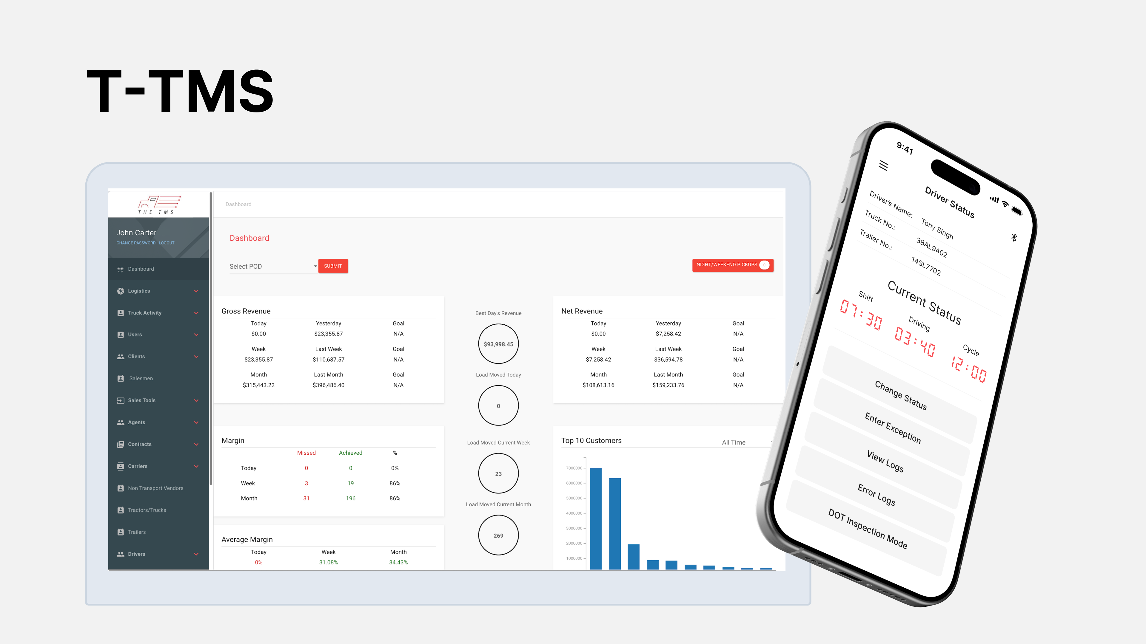
FinTrack
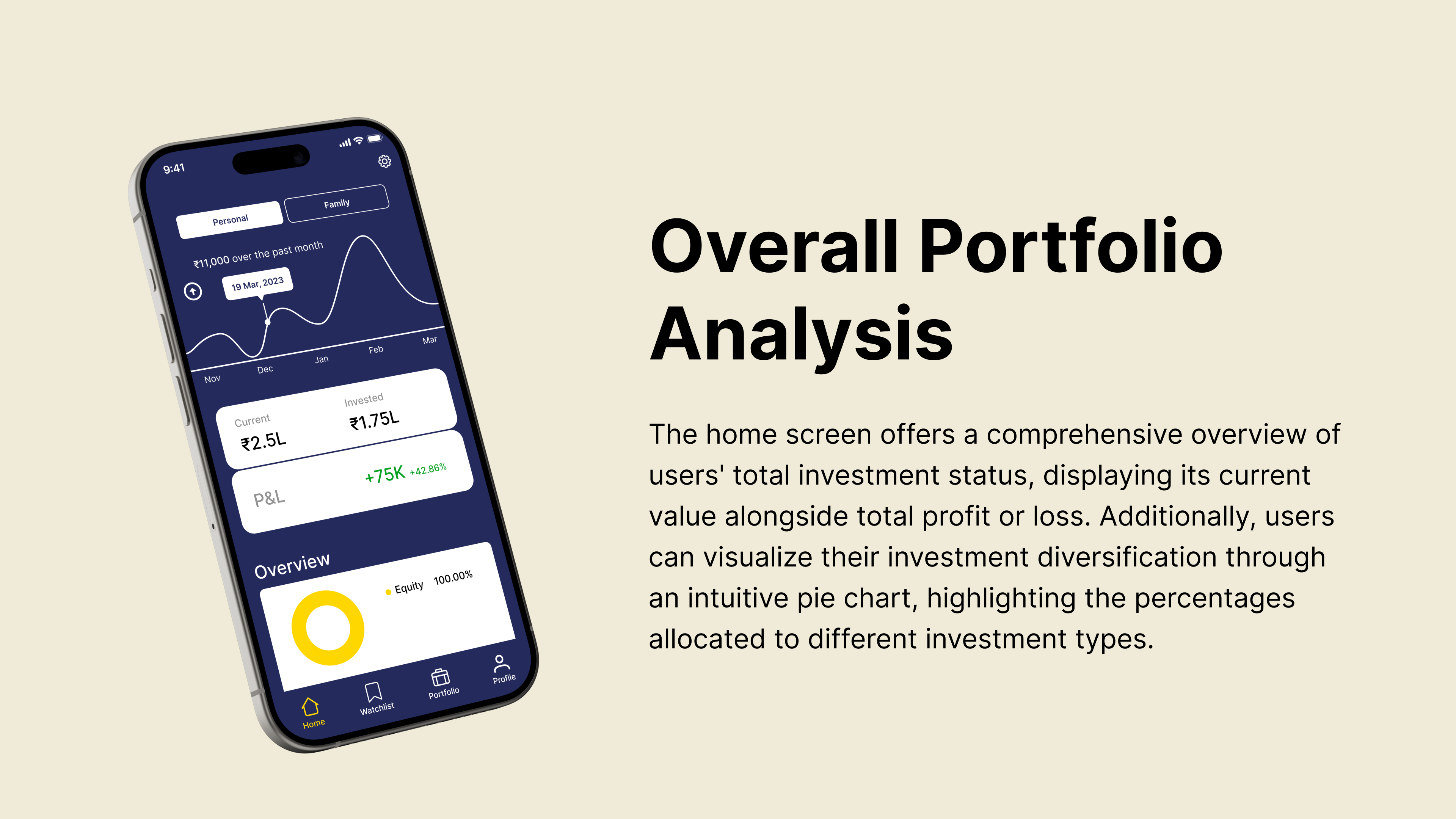
FinTrack is designed to empower individuals on their journey towards financial security and prosperity. With FinTrack, users can make informed decisions about their finances, whether it's holding onto a fund or exploring new investment opportunities.
Project
First Source Financial
Role
Product Designer / Researcher
Platform
Mobile App → IOS & Android
Tools
Figma, Miro, Teams, Jira
FinTrack offers users a comprehensive suite of features, including real-time tracking of investment portfolios, customizable watchlists for fund options, and daily insights into investment progress. With FinTrack, users can make informed decisions about their finances, whether it's holding onto a fund or exploring new investment opportunities. Leveraging extensive user research and market analysis, I helped in design and development process, collaborating closely with company founders, project managers, and engineers to bring FinTrack from concept to reality.
My role was multifaceted, blending strategic vision with hands-on execution. I spearheaded the research phase, conducting user surveys, competitive analysis, and uncovering key insights to inform our design direction. Collaborating closely with stakeholders, I translated findings into actionable design concepts, iteratively refining prototypes based on user feedback. With a keen eye for detail and a passion for user-centric design, I guided the project from ideation to implementation, ensuring a seamless and impactful user experience at every stage.
01
Empathize User Interviews User Survey Competitive Analysis
02
Define Defining Problems Persona Journey Map
03
Ideate User Flow Card Sorting Information Architecture
04
Design Initial Sketches Wireframes Mockups
05
Evaluate Usability Testing Iterative Design
In today's digital age, merely having a large clientele isn't sufficient, particularly when clients lack digital monitoring options for their investments. Investment firms must adapt to provide digital solutions for clients to track their investments remotely.
👉 FinTrack lacks a digital presence to effectively serve its audience
Implementing a robust digital framework within FinTrack will address the need for enhanced accessibility and functionality, empowering users to monitor their investments seamlessly and efficiently. By integrating cutting-edge digital features and technologies, FinTrack will provide users with a user-friendly platform to track their investments, ensuring a superior user experience.
🚀 Creating a digital platform that help client’s monitor their investments seamlessly


I conducted user survey in order to understand users’ pain points when they use an investment application. Research reported that it was difficult to get financial advice from agents to broaden their knowledge about investments resulting in missed opportunities. Having a way to quickly connect with their agents and make informed decisions.
I conducted a comprehensive user survey to gain deeper insights into my target audience and assess competing digital platforms in the market. This process illuminated key pain points and user requirements, providing valuable perspective for product development.


I also did competitive analysis to assess competing digital platforms in the market. I identified weaknesses in existing platforms, enabling strategic refinement of our product to address user needs more effectively.

A notable 78% of clients exhibited hesitancy in making informed investment decisions, resulting in missed opportunities.
Approximately 65% of clients expressed a preference for a streamlined application enabling them to monitor their investments, supplemented with graphical representations to easily discern profit or loss statuses.
After conducting extensive user research, we gained invaluable insights that informed the refinement of our user personas. Among the key findings, we discovered that users universally sought an overview of their investments. Additionally, some users expressed a desire for quick consultations with agents prior to decision-making, while others prioritized the ability to manage multiple scripts and investments within a single platform. Armed with this data, we tailored our application's features to directly address both user and business needs.


A journey map was carefully crafted leveraging insights gained from thorough research and comprehensive personas. By delving into their pain points, we strategically hypothesized and mapped out a sequence of events, paving the way for potential solutions to emerge.

The initial user flow was created to address specific pain points identified through thorough user research. Through iterative design processes, we identified and refined a primary user flow tailored to meet the core objectives of the application.
I would like to view comprehensive statistics for my portfolio, including the profit and loss metrics for each individual fund.

I would like to connect with agent for better guidance.

I would like to have list of customizable watchlist.

I employed quantitative user research method primarily to help us structure content and identify navigation patterns based on user preferences. By organizing information this way aligns with users’ mental models, and ensures that content is easily accessible and findable for them.

After developing personas and mapping out the user journey, the next step was to create an architecture for the application. This foundational flow outlines the primary functionality of the application, serving as a blueprint for further design iterations and refinements as we progress.

As we transitioned into the design phase, I began sketching initial mockups to visualize the user flow and interface elements. These early sketches allowed us to explore different layout options and iterate on design concepts to ensure alignment with user needs and preferences.

After creating a basic outline on paper, I moved on to create low-fidelity wireframes using Figma. The wireframes allowed me to refine the design further, providing a more concrete representation of the overall layout, structure, and functionality of the app. By creating wireframes, I was able to experiment with different design elements and test the usability of the interface before investing time and resources into a more high-fidelity design.

After completing the low-fidelity wireframes, I progressed to high-fidelity prototypes. These prototypes aimed to enhance the design visually while maintaining the core functionality and user experience. With detailed visuals and interactive elements, the prototypes provided a realistic representation for user testing and validation before development.

After conducting user testing sessions involving 35 participants, I led a card sorting activity to analyze and extract recurring themes and insights from their feedback, fostering a collaborative approach to discern user preferences and needs.

The application's streamlined interface led to a 40% increase in user confidence. According to feedback from early users like Priya Arora, "Navigating through the app feels effortless, making managing investments a breeze.” The revamped design resulted in a 25% decrease in user errors, enhancing overall usability.
This project emphasized the critical role of collaboration and communication among cross-functional teams. Throughout this project, I honed my skills in user research and usability testing methodologies. Conducting user interviews, usability tests, and analyzing feedback allowed me to gain a deeper understanding of user needs and preferences, guiding design decisions effectively.